MY ROLE AS A DESIGNER
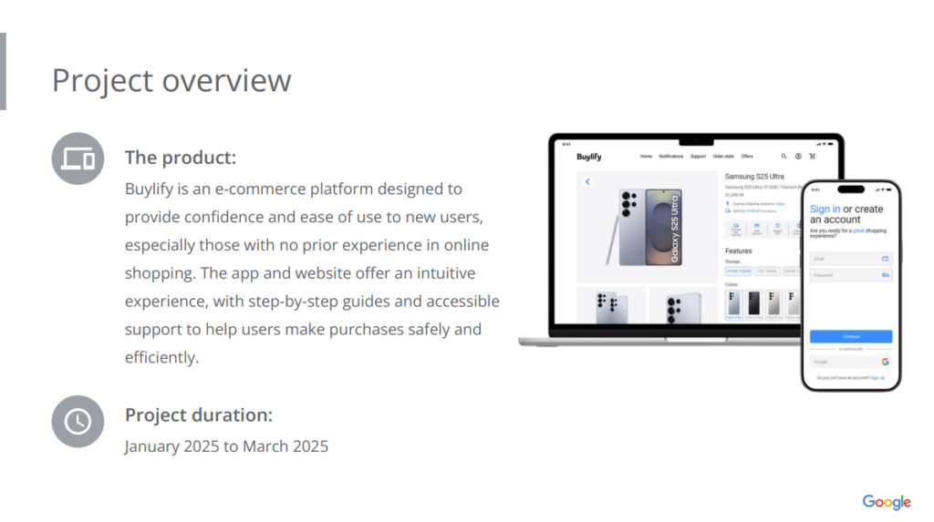
In this third project of my Google UX certification, I focused on developing a project that would fulfill a public interest initiative. To achieve this, I decided to design a mobile app and a responsive website for an e-commerce platform dedicated to providing confidence and ease of use to new users, especially those without prior experience with online shopping. My responsibilities included conducting interviews, creating paper and digital wireframes, developing low- and high-fidelity prototypes, conducting usability studies, considering accessibility, and continuously iterating on designs to ensure a smooth and satisfying shopping experience.

PROJECT’S GOALS
Buylify’s main goal was to create a platform that inspires confidence and facilitates the purchasing experience for new users, offering an intuitive interface, clear guides, and available support. The project aims to lower the barrier to entry for those looking to purchase online for the first time.

TARGET USERS
The project focuses on two main user groups:
- New Buyers: People of all ages, especially adults over 40, who feel insecure about buying online due to lack of experience or fear of scams.
- Beginner Sellers: Entrepreneurs looking for a simple and reliable platform to sell their products online without technical complications.
Main challenges and limitations
- User confidence: Many new buyers may be insecure about purchasing online for the first time.
- Intuitive navigation. Users needed a clear interface to feel comfortable making purchases.
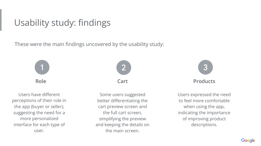
- Customization for different roles: Users had different perceptions of their role on the platform (buyer or seller), which requires a customized interface for each type of user.
RESEARCH STUDY DETAILS
I conducted research with users new to online shopping, conducting usability tests with initial prototypes. This led me to discover that those over 40, in particular, faced some challenges when shopping online for the first time.
I also conducted a competitive audit of platforms such as Shopify, WooCommerce, Amazon, and Etsy, identifying best practices and opportunities for improvement for new users.
INITIAL DESIGN CONCEPTS
Based on the research, I began by creating digital wireframes that prioritized the placement of key elements, such as the navigation bar. I also developed a low-fidelity prototype that covered the main user flow, from searching for a product to the checkout process.

USER TEST RESULTS
I conducted an unmoderated usability study with 5 participants, this study revealed some key findings.


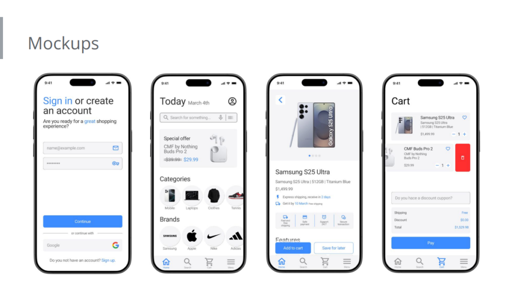
MOCKUPS AND HIGH FIDELITY PROTOTYPE
Based on the findings of the usability study, I made changes to the mockups to improve the user experience.


RESPONSIVE WEBSITE DESIGN
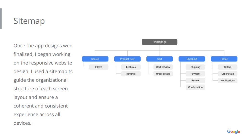
Once the mobile app designs were finalized, I began working on the responsive website design. To guide the structure of each screen, I used a sitemap to ensure a consistent experience across all devices.

The website design has been optimized for different screen sizes, including desktop and mobile devices.

WHAT DID I LEARN FROM THIS PROJECT?
Through this project, I learned the importance of designing with new users in mind and how small details in the interface can have a big impact on user trust. Visual hierarchy, simple navigation, and clarity of information were key to improving the user experience.
In the near future, I will be working on developing the seller interfaces for the platform, as well as adding new features to the platform and improving the designs based on additional usability testing.
If you’d like to see more details about this project and access the prototypes, check out this presentation. Thanks for checking out my work!